EDMODO BRANDING, ILLUSTRATION AND ANIMATION
When I started working at Edmodo as a product designer in 2016, I immediately noticed that the brand was all over the place. Outside the product and within, the logo, colors and typography were being inconsistently used. I took this as an opportunity to make some quick wins and forge some cross functional good will within the company, and decided to make a project out of creating guidelines for the usage of our brand elements and applying them to the product. It was the ideal “low hanging fruit with a big impact” type of project whose success would serve as an introduction to the power of brand and personality to the rest of the company.
After about a year of sitting with our tighter, more coherent brand, both the head of product and marketing liked what the guidelines had done for the product and brand and would like to see it developed further. Not really a re-brand, but an expansion of our brand and personality into illustration, animation and interaction. Below is a summary of the initial ‘guideline creating’ phase and a sampling of the illustration and delight work that it led to. Enjoy.
Branding refresh
Logo
While I’m sure that at some point the Edmodo logo had usage guides, by the time I started at Edmodo they had been lost to time. Inconsistent use of the logo was rampant within the product and our own marketing assets (see accompanying image).
I worked with my design counterpart in marketing to create a standardized relationship between the icon and text, a standardized text treatment and rules regarding when to use the light vs dark versions. We also created an easy to reference usage guide with pre-made logo assets that users could download and use without having to create their own (yes, pretty common sense, but this is what I meant by low hanging fruit).
Very bad, actual uses of the logo
Official logo lockups on light and dark backgrounds
App icons with new logo standards in place
Colors
Colors also had a consistency problem all over the product and marketing materials. There was no such thing as any official colors, just a myriad of similar desaturated blues and greens.
New official color palette
Rough approximation of old colors
Most of our new users were millennials with favorable views of popular social media brands like Instagram and Snapchat, so we knew we wanted to move our colors in a more vibrant direction to make the brand feel younger and refreshed.
Working with product, I created a few new working UI palettes that kept blue as our primary color and expanded our color options. The palette to the left is the one that product selected and we rolled it out to the brand.
Typography
On the product side, typography wasn’t too tricky to fix up. I decided that instead of using many proprietary fonts inconsistently, we’d start using system fonts consistently. That meant that on each platform, only a single font family would be used within product. Edmodo is a very UI and dashboard intense product, and having reliable, clean font display is paramount.
On the marketing side, the font GT Eesti was selected for all of our brand marketing materials.
Icons
Icons had never been coherently used or styled in our product. When I started, we were using icons from at least a dozen different free icon sets in no particular order.
I created a library of our own custom-tailored and stylistically unique icons to replace the dozens of strange sets in use within the product. I talk A LOT more about creating this icon set over in my design system section.
Illustration
Edmodo had been using illustrations from many different, stylistically distinct, free clip art packs. So many illustrations were used, in fact, that I felt it warranted creating our very own stylistically distinct illustration system.
Using our new color palette, I created a wide array of illustrations and style guidelines to serve as a foundation for all illustrations moving forward. I did most of the illustrations myself, but a few were created by very talented freelance illustrators that I had the pleasure of Art Directing.
iOS Emoji Sticker Pack
Illustrations, Animation and Delight
Its easy to see why you may need branding assets created for marketing reasons, but the purpose of brand elements within the product is a little less straight forward.
Using a product to solve a problem is rarely a purely logical or utilitarian act. Humans have a range of emotional needs alongside their technical needs and successful brands know that fulfilling emotional needs is just as important as fulfilling utilitarian ones.
Regardless of whether you are conscious of it or not, your product WILL have a “feel,” and if you don’t actively acknowledged it, you will not be able to understand or harness its benefits to your business.
Products with emotionally invested users enjoy many benefits including longer retention, better conversion rates and a higher rate of user evangelism, just to name a few.
So, how do you encourage emotional investment in something like an app? There are many ways, too many ways to list here, so I’ll just say this: It’s impossible to have a relationship with something that has no personality. Illustrations, animations and interactions within the product can be used as touch-points to establish a crafted personality for your product.
Illustrations
I created most of these illustrations myself, but a couple were created by illustrators under my direction.
Teacher network hero image
Edmodo.com homepage updated with branding guidelines and illustrations
Updated marketing email template
Updated transactional email template
Hero image for the 2018 Back to School redesign
Hero image for the launch of Edmodo Recommendations product feature
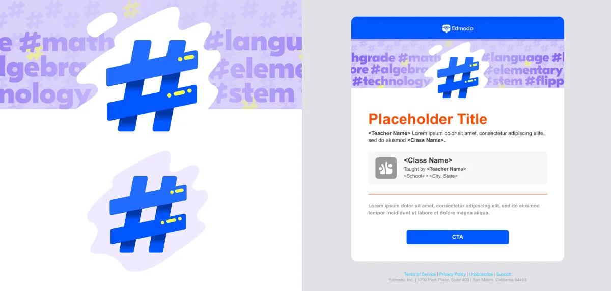
Hero image for the launch of Hashtag Topics product feature
Custom 404 Error page illustration


Subject icon illustrations
A selection of Edmodo Awards Badges
Product Features
Under Construction


