SYLLABUS
The Edmodo Design System

Syllabus is a simple and efficient design system built to provide maximum usability to our users and maximum flexibility to our product builders. Edmodo supports a vast amount of features, from file libraries to classroom management tools. In any given session, a user could jump between any number of these distinct features and it is absolutely crucial that they be able to do do so seamlessly. A robust, flexible design system can provide a sense of coherency across these features so that users can focus on completing their own tasks instead of on learning new UI.
Styleguide
Color
Primary PALETTE
Edmodo’s primary app colors feature a significantly shortened list of colors derived from the extended brand color list. Navigation, calls-to-action and most other UI elements should all be created using primary pallet colors.
Primary actions should be Gold. Secondary elements should be Indigo. Tertiary and UI elements should be made with the various Grays.

Status PALETTE
Status colors are used in the interface to reflect specific statuses or communication types tied to each color. These colors should be used exclusively when intending to reflect a status.

Color Families
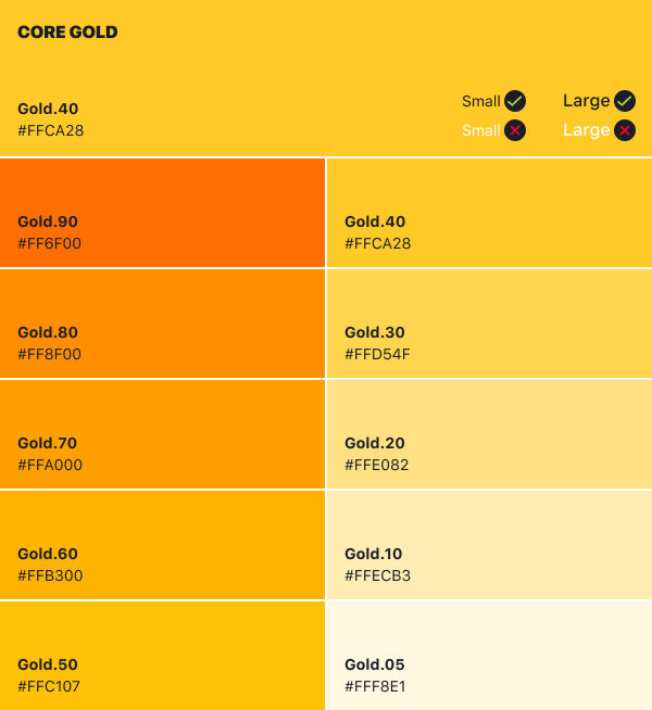
All hued color groups (everything excluding Grays) have a core shade. When using one of these color groups, always begin with the core shade and adjust either lighter or darker as necessary for your application.
For example, if you are creating a new error message, begin with Red.90 (that is the core shade of Red, notated below) and then adjust lighter or darker if necessary.
Color families, excluding Gray, will display what colors of text pass and fail WCAG AA accessibility standards. Small text is considered text of 14pt size and regular weight and lower, large text is considered anything larger or heavier. For more information on color accessibility, check out WebAim.org
GRAYS
Light Grays - Fills, Backgrounds and StrokesLight grays are generally used as background fills for a page’s entire background to buttons, fields and cells. Use light grays when you need to subtly define a UI element’s area such as a hover state.

Medium Grays - Interactive UI Elements
Medium grays are almost exclusively used for interactive UI elements and low emphasis text like metadata.

Dark Grays - Text
Dark grays are mostly used for text. Can be used as selected states for some interactive components.

GOLD
Gold is used for primary actions. Use sparingly.
INDIGO
Indigo is our secondary UI color. Most standard calls to action and prominent UI elements are indigo.

OLIVE
Olive is used to reflect success. If a successful action/state needs to be reflected to the user, consider using Olive.


RED
Red should be used to convey errors and potentially destructive, permanent actions like “delete.” Also, can be used to communicate urgent statuses like “late.”


BLUE
Blue should be used in the context of help and info. Small usage hints/tutorials and low priority activity flags should use the blue family of colors.


Typography
Typographic elements make up most of Edmodo’s UI. Type should be clear, clean, simple and consistently displayable across multiple browsers and devices.
Font Stacks
Edmodo uses clean and simple serif fonts. Picking system fonts allows us to maintain a high level of display reliability.
OS
MacOS
Windows
Chrome OS
Primary Font
Helvetica Neue
Segoe UI
Roboto
Fallback Font
Helvetica
Arial
Noto Sans
Type Styles
Creating and maintaining a clear page hierarchy is an utmost accessibility concern, and it can almost entirely be done by maintaining a clear typographic hierarchy. Knowing how and when to use our type styles is key to creating an accessible layout.
UI Styles
When a text elements is going to behave as a UI element, use a UI style. UI elements typically are only a few words and are very rarely more than one line. Headers, labels and buttons are all examples of when a typographic element is considered UI.

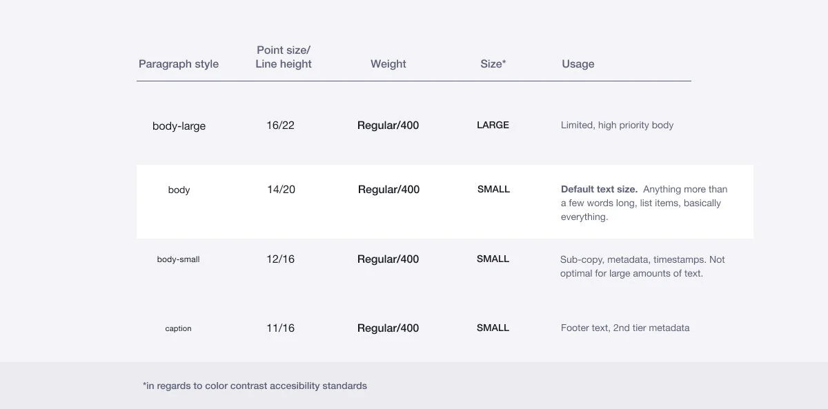
Paragraph Styles
When text will be longer than a single line, will be a full sentence with punctuation or is acting as actual editorial content (posts), your text should use a Paragraph style. Maintaining and communicating a clear hierarchy is also very important in content copy.
Style Options
These are additional style options that can be applied to any text style.

Paragraph Width
Long form content is hard to read if the line length is too long or too short. “How long is too long or too short?” you may ask. Well, it depends on what size of ‘body’ you are using. See the diagrams below to roughly gauge the ideal widths for your size.
body-large

body

body-small

Icons
Icons are primarily used to lend visual weight to chosen parts of the UI to aid usability. Secondarily, they provide visual hints to the actions they are associated with in the UI. I specifically say “hints” because icons themselves can never be expected to communicate the exact action or function of a UI element. Convention and repetition can make a lone icon’s function learn-able, but strongly consider accompanying it with a text label.
icon Dimensions
Icons are created within a 24 x 24 pixel square with a two pixel interior buffer on all sides. This leaves a roughly 20 x 20 safe area to create your icon.

For visual consistency’s sake, stamp icons (I’ll get to what that means in a second) should roughly adhere to one of the following shapes:

While icons must be created at the 24 x 24 standard size, they can appear at multiple sizes within the product: Small, Standard, Large and Extra-Large.

Icon Styles
Icons adhere to one of two general graphical styles: Stamps and Strokes. Stamp icons are feature related actions and Stroke icons are more system related.
Stamp Icons
Stamp icons depict and summarize specific actions and/or areas. There should be very little ambiguity in what they represent, but sometimes a little vaguery™ may be unavoidable.
Guidelines for making Stamp icons:
Stamp’s primary masses are solid, filled in. Outlines are permitted, but use only when unavoidable.
Stamp corners are rounded at 2-3px. Use rounded corners by default but hard corners are allowed when necessary.
Stamps that contain a stroke element WITHIN the overall shape should use a 2px stroke
Stamps that are solely stroke elements should have a stroke width of 2px
Human shapes/ forms are always asymmetrical or rounded.

Stamp Icons
Stroke Icons
Stroke icons are abstract icons that represent the most basic and non-specific ideas of navigation and actions. Context, convention and repetition will do the heavy lifting in setting user expectations.
Stroke icons use a 2px stroke
Strokes have rounded caps
The vertex of stroke icons have slightly rounded corners within 1-2px

Stroke Icons
Icon usage
So, you’ve just released a feature or some new functionality in your product area and you’re looking to load it up with some shiny icons. I don’t want to discourage you from using icons, but you might need to slow your roll. After all, if everything has an icon, then nothing has an icon. Icons should be used for a specific effect, and in order to know how, we must first understand the icons themselves. Below is a conceptual break down and rules for different categories of icons.
Features
Features represent areas of the product that are very unique to the product itself. Classes, assignments, grade book and library are all very specifically “Edmodo” features. Because our features are very unique to Edmodo, their icons probably wont be recognized without a label. When using an icon for a feature, you’ll primarily be using it for scanning purposes, like in the top or bottom nav and accompanied with a label.
General
General icons are our more conventional and recognizable icons. These are icons that represent well known actions, such as the “camera” icon and the “Attachment” paper clip icon. Its generally ok to use these without labels. General icons will frequently be featured in rows of multiple icons.
System
System icons are by far the most conventional and rarely require a label due to their repetitive behavior across many products. A large “X” in the upper right corner of a modal and the downward triangle next to a label for a drop down menu are both examples of system icons.
System Icon Conventions
System icons are the most abstract icons in our library. Because of their abstractness, its important to communicate their meanings by creating conventions and repeating them within the product consistently.
Chevrons
The up and down chevrons should be used to manipulate the visibility of a set of data. Collapsible (accordion/twisty) menus are handled with chevrons. Reordering a set of data (ascending/descending/newest/oldest) is also handled with up and down chevrons.
Left and right chevrons should be used for navigation (back/forward, etc).
Triangles

Actions that will result in a menu being spawned will contain a triangle, if an affordance is necessary. As a rule, triangles are used in form elements like drop downs and buttons.
If an item in a menu would spawn another sub-menu, left or right triangles should be used (probably right).
Assorted icons
buttons
Buttons generally trigger actions and submit changes. Buttons are almost always created from some combination of an icon and a label. When writing a label, there is one specific rule and one general rule to keep in mind:
Labels are title case
While labels should be as short as possible, they should also be as specific as possible. For example, if a button closes a modal, don’t label that button “OK,” label it something like “Done,” or “Close.”
Rectangle buttons
The different strengths of button can be used to call attention to multiple different locations on a page where these actions may take place. The options here are pretty vast to allow designers to create a well balanced layout. Primary buttons should only appear roughly once per screen or focused section (modals, whatnot). Keep in mind that not every screen needs a Primary styled button. Secondary buttons can appear pretty frequently without adding much visual weight. Tertiary buttons carry very little visual weight and can be safely used in button-dense layouts.
In addition to their various emphasis levels, buttons can exist at multiple sizes. The standard size is surprisingly called, Standard. Even more bizarrely, small buttons are called Small and large ones, Large.

Button spec for buttons of all sizes

The Standard size for buttons is the default size that should be used whenever possible.

Large buttons. Note that the large button has completely rounded corners.

Small buttons. Small buttons cannot be constructed from a sole small icon.
Label buttons
Label buttons are generally used for navigation. Clicking a link may filter or toggle something on your current page, but they wont pass any changes to the back end of the site.

Label buttons. Note that they only exist at a single size.
Split buttons
Some buttons are adjoined to a field or another button. Stylistically these buttons follow the same general rules as standalone buttons with one very important difference: Buttons can only be adjoined to elements of their same size category. A standard size button can only be joined to a standard sized field, etc.

Fields
Fields are parts of the UI that users can fill with information. A single fields or a group of fields will typically be associated with a button that will send its information to the back end of a site.
text fields
While other types of fields exist, our product primarily uses text fields. While most accompanying text is optional as well as an icon, one label is required to be associated with text fields. The ‘field label’ and the sample text within the field can both function as a label. Both or either can be used, but not neither. The ‘feedback text’ area should only be used to convey important information about the field it is associated with.


Drop down Menus
Drop down menus are an array of options for a single field. They can be triggered by interacting with a text field or a button.

Additional Inputs
Besides buttons and text fields, there are a few other extremely common types of inputs that basically any modern interface requires to function. These inputs are heavily conventional but some small touches have been added to improve their accessibility.
Radio Buttons
Radio buttons represent a group of options that only supports a single selection. Selecting one option deselects all others.
Check Box
Check boxes represent a group of options that support multiple selections. All check boxes can be individually toggled.
Toggle
Toggles are a simple “on/off” element, but differ from all other inputs in one particular way: they immediately submit their state to the back end. Because of this, a user turning a toggle on or off should immediately see its results without having to click a "save” or “submit” button.
Most toggles simply communicate their status with color, but this method fails many visually impaired users. We’ve added a check and an “x” to communicate what state the element is currently in.
Sliders
Sliders are a specialized single value or range selector that is useful in very specific sets of data such as age groups and year ranges.
